
Beach Boy Commu —
Brand & Commerce Site Redesign
A full redesign of a Thai surf-and-beachwear brand's online store — from a scored audit of the live site, to a client-chosen direction, to desktop and mobile UI and a rebuilt front end.


Overview
Beach Boy Commu is a Thai surf and beachwear label — bucket hats, surf caps, swimwear — sold online and through stockists across Thailand.
The live site scored 22 on mobile performance, buried products under a flat category list, and leaked orders: the shop's own API dropped some purchases and recorded the wrong colour on others.
As the designer on the project I ran it end to end in Figma — scoring and auditing the live site, gathering the problems from the client, restructuring the catalogue, presenting wireframes in several directions, then building the final desktop and mobile UI for handoff.
How I ran the project
Three phases, a named deliverable at every step.
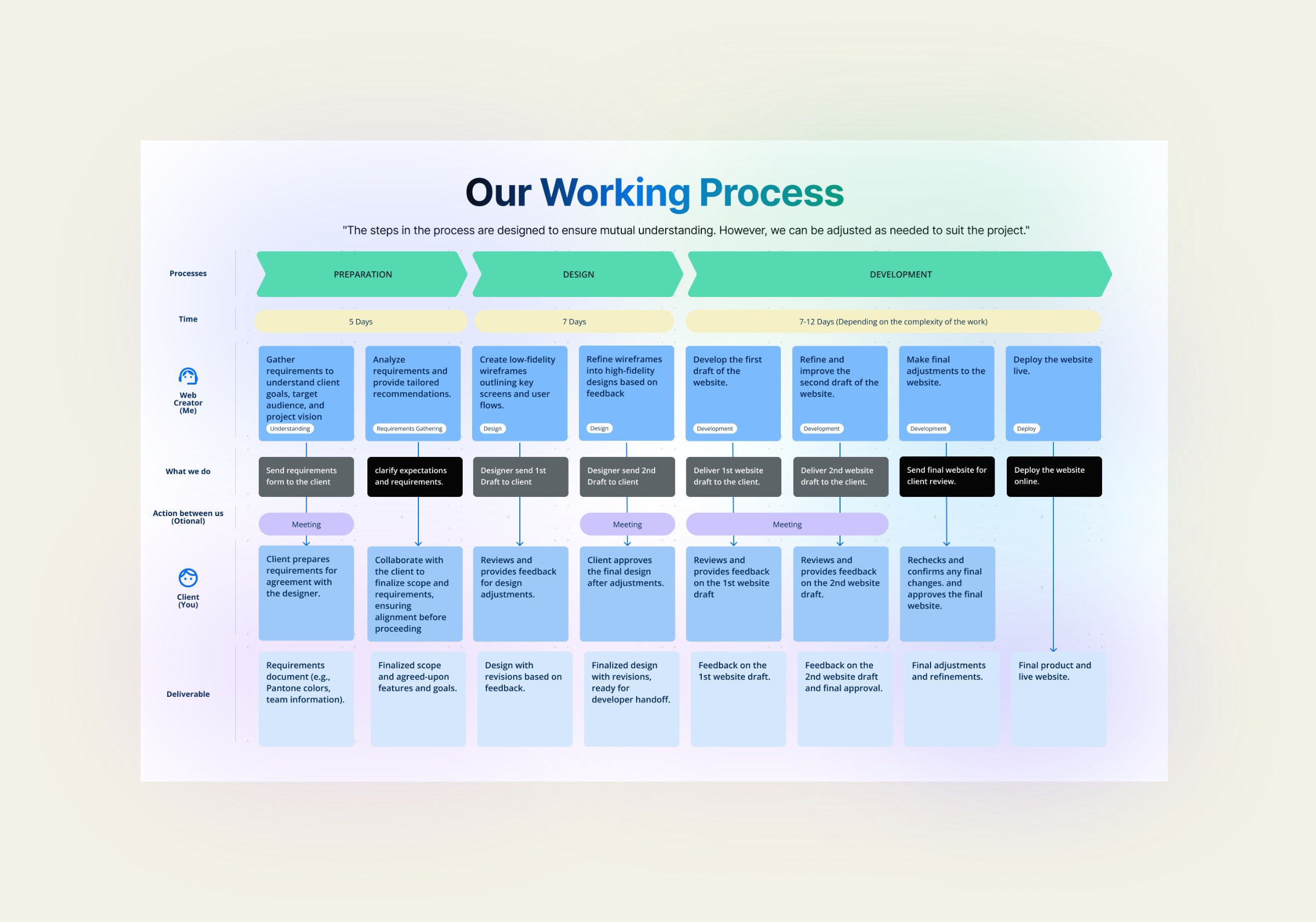
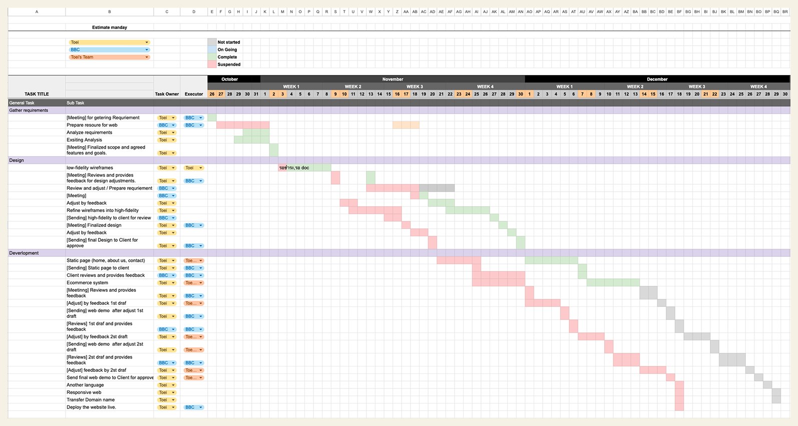
Before any screens, I agreed the shape of the project with the client: three phases, a fixed number of working days each, a named deliverable at every step, and a meeting at every handover. Feedback lands at a planned moment instead of arriving mid-build.
Preparation — 5 days
Gather requirements, analyse the existing site, agree scope and features.
Design — 7 days
Lo-fi to hi-fi wireframes, two review rounds, finalised design for developer handoff.
Development — 7–12 days
First and second web drafts, responsive pass, second language, domain transfer, deploy.

What the client told me
The problems that mattered were operational.
The problems the owner cared about were not visual. They were about orders arriving intact, and about being able to run the shop without a developer.
Some orders never reached the shop at all.
Orders that did arrive recorded the wrong product name and colour.
Customers received their confirmation email while no order appeared on the shop's side.
Stock could not be edited from the storefront — every change meant going into the back end.
Scoring the existing site
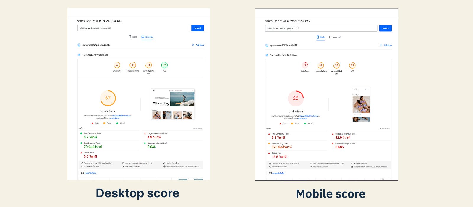
PageSpeed Insights, 25 October 2024.
Rather than call the old site slow, I measured it — beachboycommu.co, mobile and desktop.
A 32.9-second largest contentful paint means the hero image is effectively never there for a customer on a phone. A CLS of 0.685 means the page moves under their thumb while they are trying to tap. Those two numbers set the priority for everything that followed.
Analysis and recommendations
Page by page, each fix with a reference beside it.
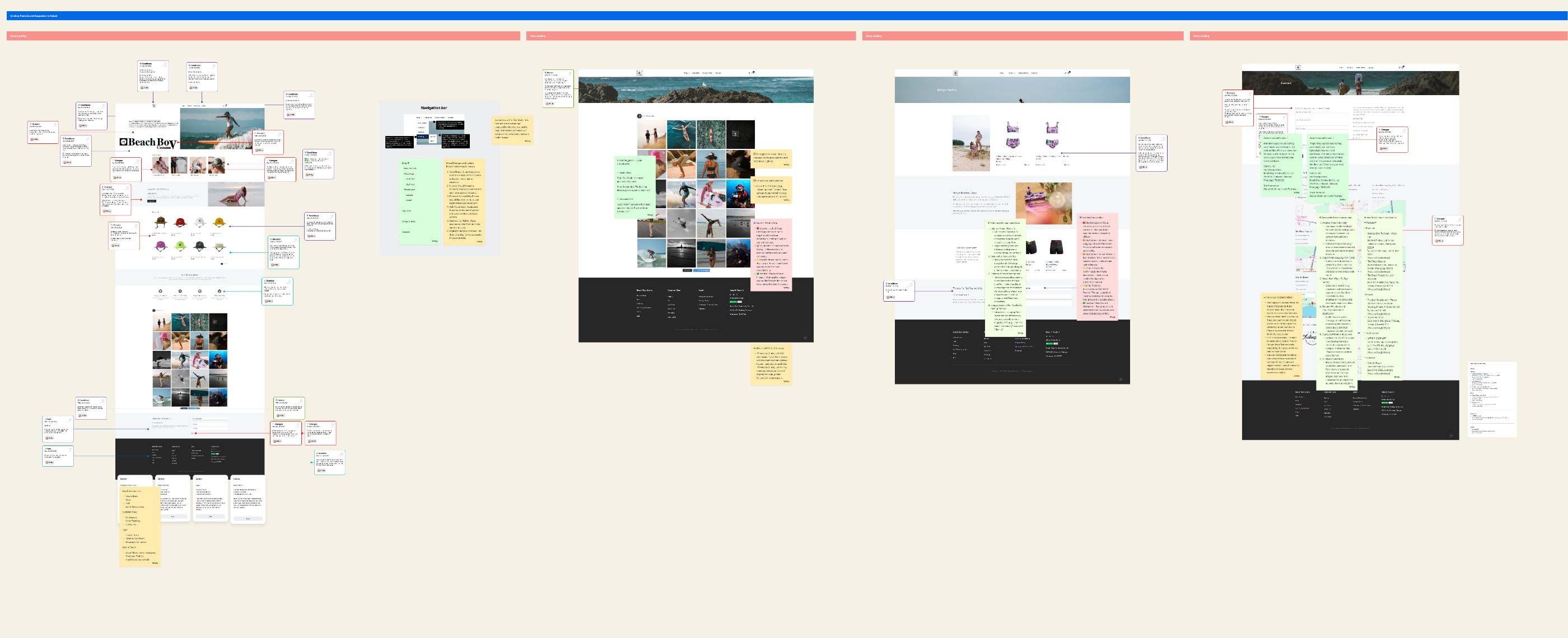
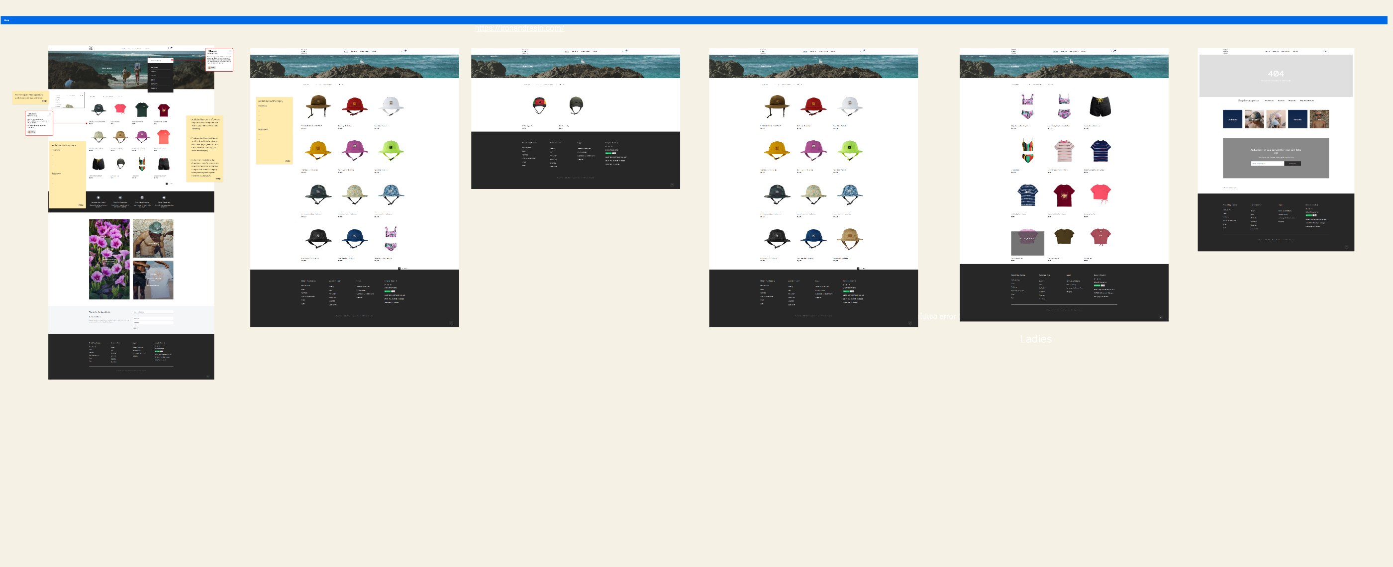
I went through the live site page by page and annotated what to change and why. For each recommendation I pulled a reference from a comparable brand, so the conversation with the client was about a concrete example rather than an opinion.
The catalogue was the biggest structural fix. Products sat in one flat list, so a customer looking for a surf cap browsed everything the brand made. I regrouped it around how the brand actually sells:
The same regrouping drives the shop filters, the navbar dropdown and the related items on a product page — one structure, three places it shows up.
Wireframes, and letting the client choose
Several versions per page, one recommended.
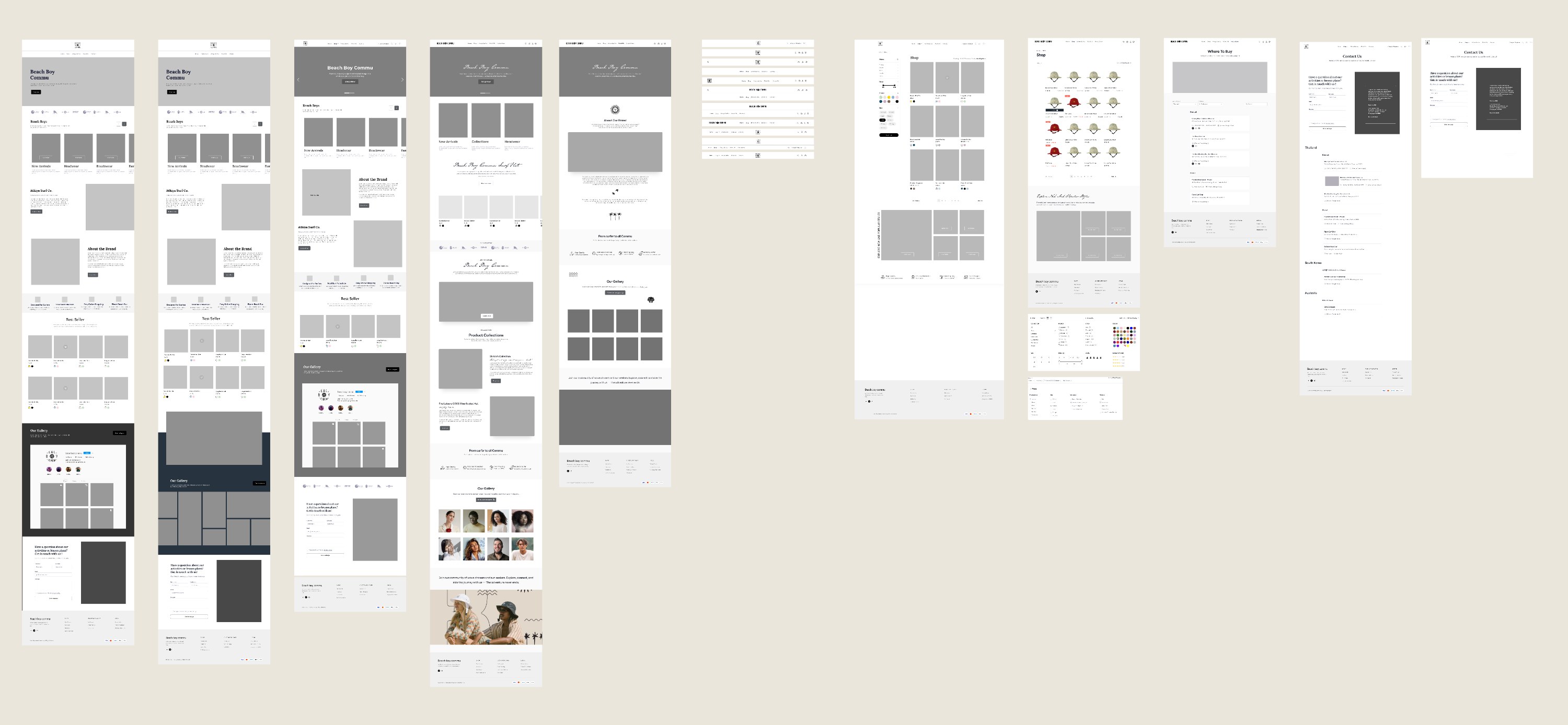
I did not present one answer. For each key page I built several wireframe versions, marked the one I recommended and said why, and let the client pick.
Every version was held to the same checks — one clear primary action per screen, product visible without scrolling, any category reachable in one step, and the brand's photography doing the selling rather than the copy.
The version the client chose is the one that became the final UI — the section that follows is that decision, built out.
Final UI
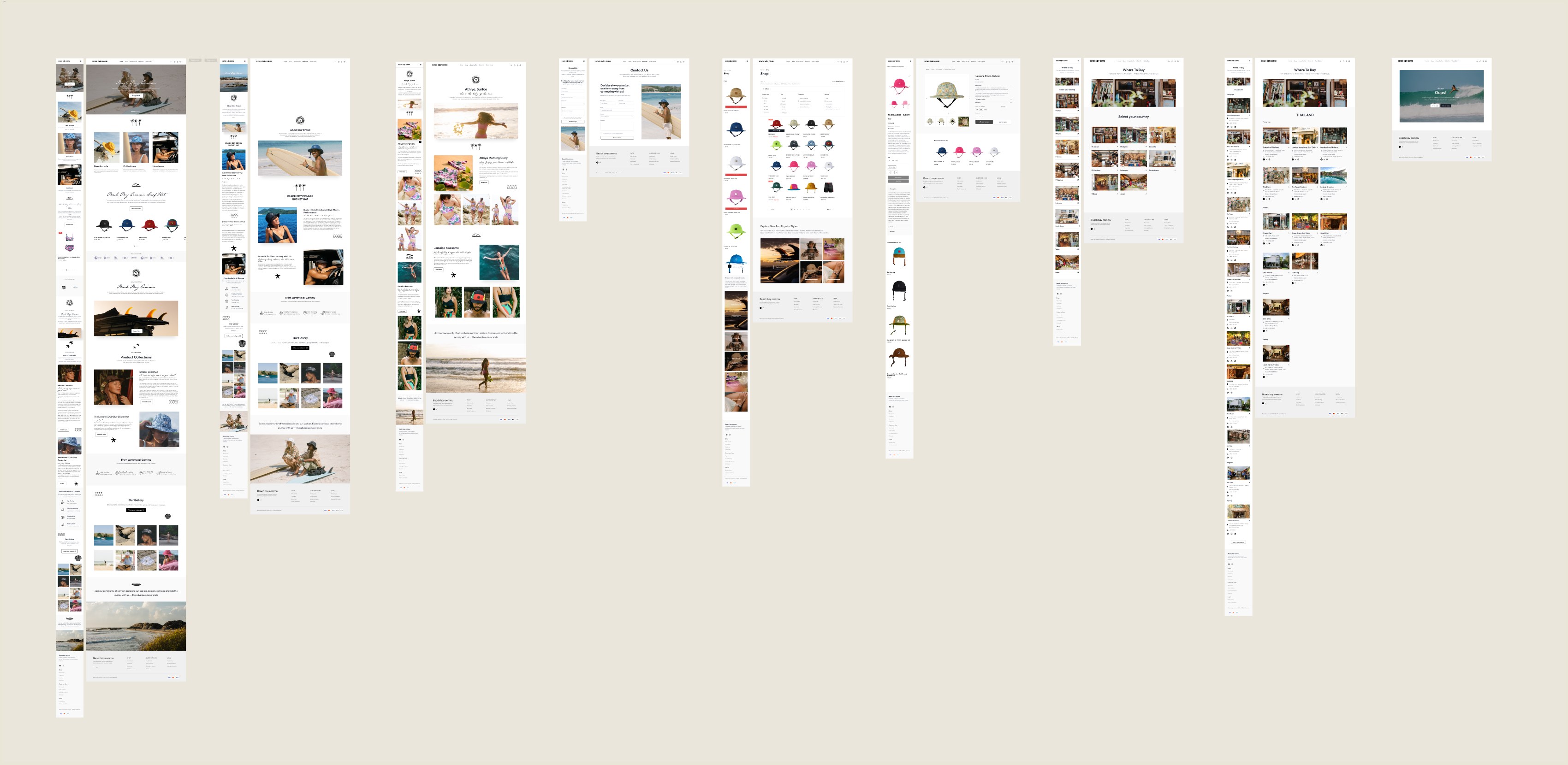
Ten desktop pages at 1440.
The visual direction leans on the brand's own photography — surf, sand, daylight — with type and chrome kept quiet so the product carries the page.

Page by page
Result
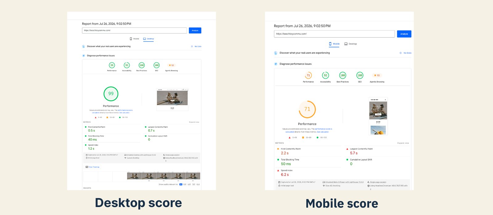
Desktop performance went from 67 to 99, with largest contentful paint down from 4.9 s to 0.7 s.
Before measured on beachboycommu.co (25 Oct 2024), after on beachboycommu.com following the domain transfer. Desktop figures only.
Takeaways
Working with a client who runs the shop.
Scoring the old site first gave the project a number to argue with.
"It feels slow" is a preference. A 22 is a fact, and it decided the build order.
Three versions with a recommendation beat one polished proposal.
It moved the client from judging taste to choosing a direction, and the review meetings got shorter.
The problems that mattered most to the owner were operational, not visual.
Reading how orders actually behaved before drawing anything changed what the shop and product pages had to do.