
Patient App — Layout & Navigation Overhaul
A two-week sprint to restructure the layout, navigation, and core ordering flows of the Patient App — the clinician-facing patient chart inside a hospital EMR. A major structural pass on a system physicians live in all day.
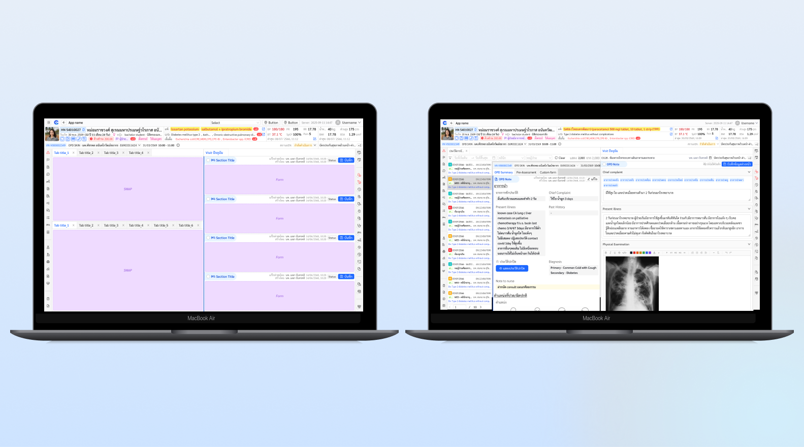
Overview
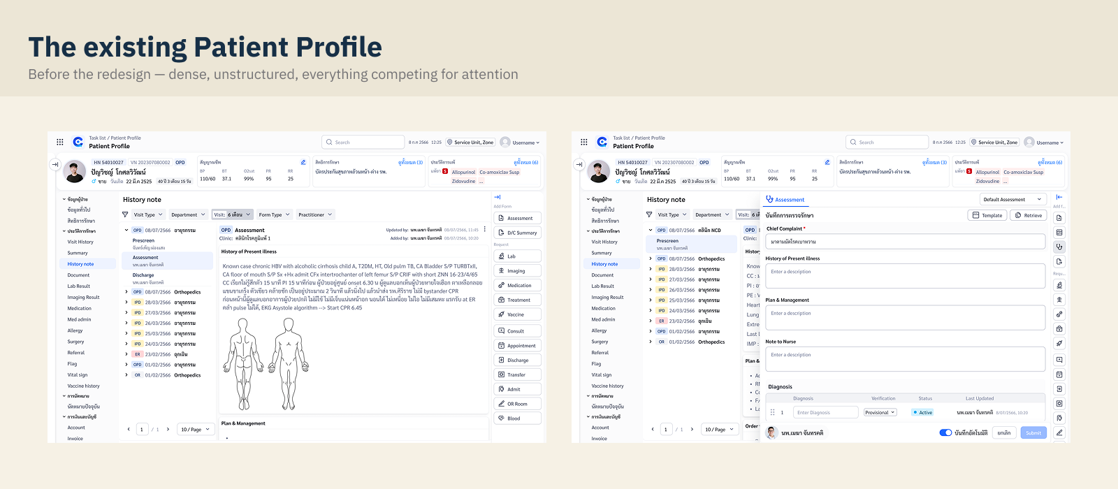
The Patient App is the screen physicians work in during every OPD visit: reviewing history, checking labs, writing notes, and placing orders. Years of feature growth had left it crowded — information scattered across the page, a left menu that kept growing, and core actions buried under clicks.
This project was a structural overhaul, not a feature add: re-lay the page, re-order the flows, and re-group the navigation — in roughly two weeks, with just enough research to de-risk each decision.
The work had two layers. The outer layer was the full layout and flow overhaul of the whole page. Nested inside it was a focused sub-study on the left-menu navigation — the hardest information-architecture decision, so it earned its own round of card sorting and testing. This case study zooms out to the system, then in to that deep dive, then back out to the final layout.
Framing the sprint
Focus area: OPD → Order → View (medical documents / current treatment).
With two weeks, the sprint needed sharp edges. We defined success as measurable behavior change, not visual refresh:
Understanding current behavior
Journey mapping and annotated screens, end to end.
How physicians actually worked through a visit: open last visit's history → review labs → write/print the OPD card — with some cases still handwritten on paper. Current screens were annotated end-to-end to trace where time went. Pain points were mapped to UX solutions across four areas:
Efficiency & Time. Heavy screens, information overload (e.g. Clinical Chemistry), slow scanning across a crowded page.
Data Visualization & Alert. No summary of "what's new to review", lab trends hard to see in context, missing alert color conventions.
Input & Action. Templates under-used, "Remed" placed far from the medication list, no "load previous session", saves fail silently when mandatory fields are missing.
Others. Frequently-used labs (Clinical Chem & Hemato) hard to reach, cost summary buried.
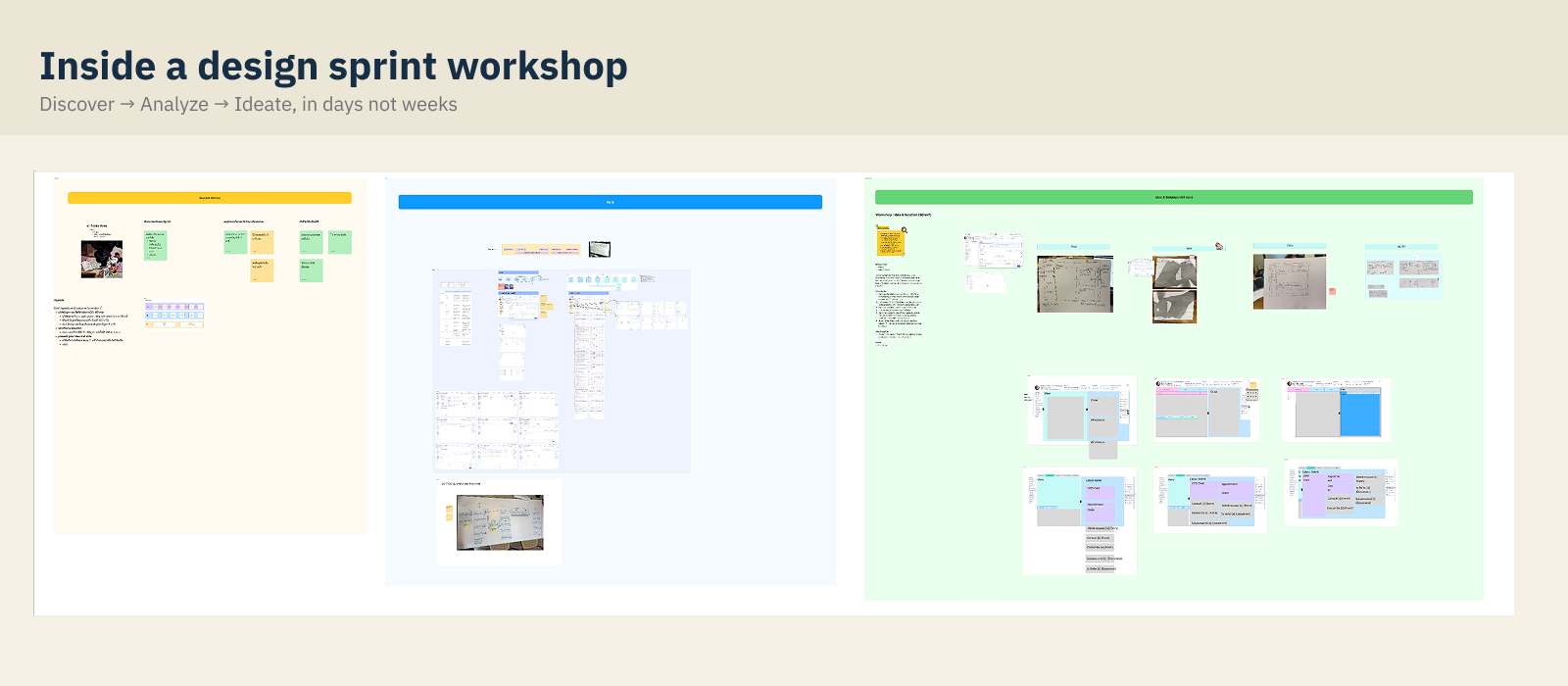
Idea & Solution workshop
30 minutes, paper, and a vote.
A time-boxed 30-minute workshop: sketch solutions on paper against the HMWs, present, vote, and let PD/PM arbitrate scope. Kept ideation cheap and fast — fitting the two-week constraint.
Left-menu navigation
A focused sub-study inside the layout project. The menu was the single hardest IA decision — so it earned its own research loop: problem, first grouping, and a card sort that overturned our assumption. Sections 05–07 sit on a cream background to mark this "zoom-in."
Rethinking the left menu
deep dive · where the menu had gone wrong.
The left menu had grown item by item until it violated its own purpose:
Too many items to scan — classic Hick's Law territory. Icons ran out — custom icons everywhere, recognisable to no one. Hover-cascading submenus — fragile and easy to lose. No user memory — the menu never adapted to how a physician actually works.
Design questions we set out to answer: How should items be grouped? Does hover or click work better for submenus? Would shortcuts / favourites help? Can a panel listing all menus replace deep nesting?
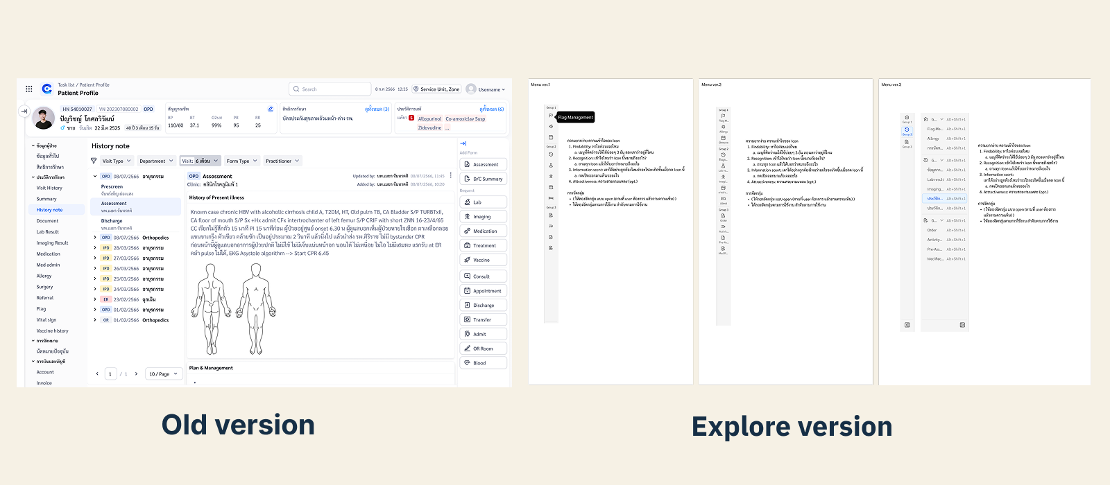
Grouping by clinical workflow
deep dive · the first proposal.
First proposal grouped every menu item by the stage of a clinical visit:
A clean model on paper — but it was our mental model, not necessarily the physicians'. So we put it in front of users.
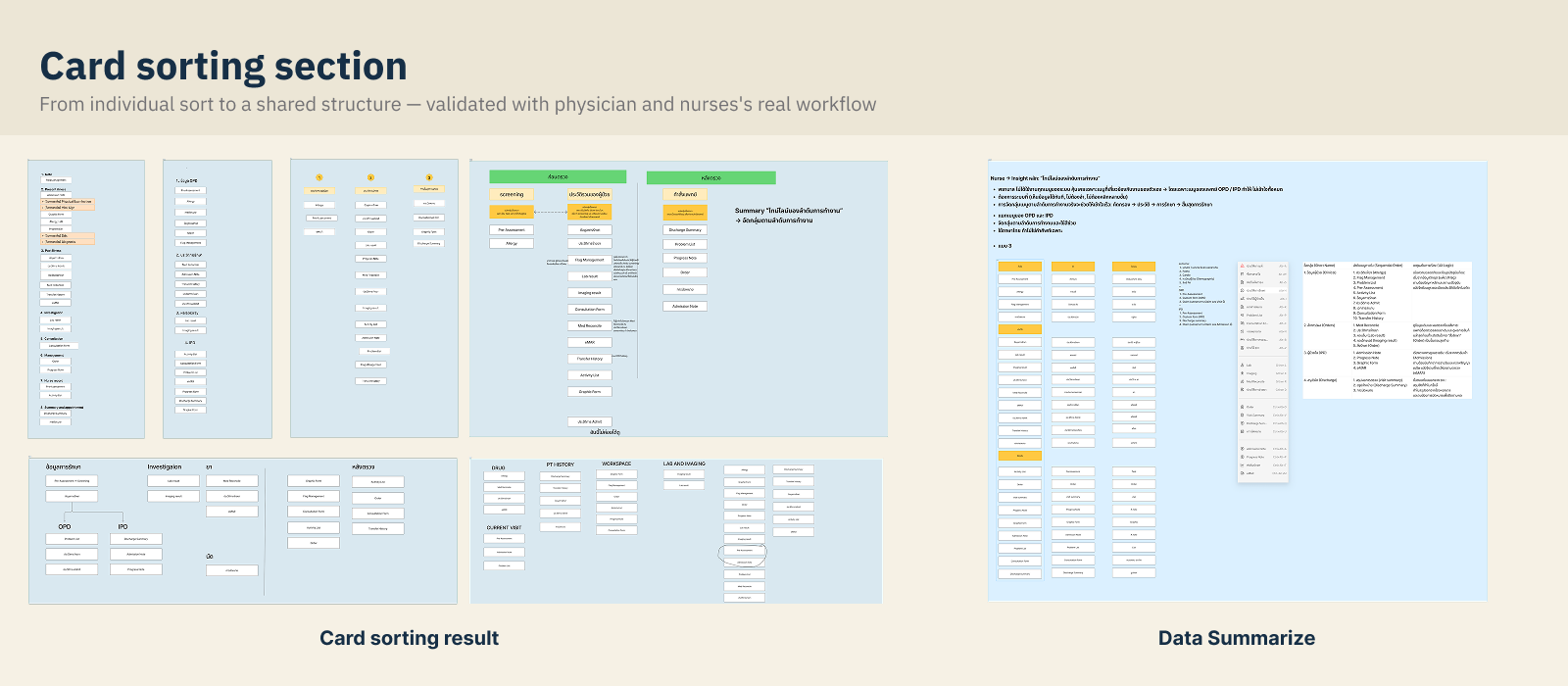
Card sorting with physicians
deep dive · the hero — where our model got overturned.
Three quick test formats, 10–15 minutes each, with 7 participants: card sorting (paper), a live menu test on the real system, and a prototype usability test — the menu validation run together with the design team. Physicians re-sorted the menu into a structure that matched how they think:
Physicians didn't think in process stages — they think in "what already happened, what I'm doing now, what I'm waiting on."
With the menu validated, the new past / present / pending grouping fed straight into the final page layout. Zooming back out to the whole screen.
Layout redesign
The whole page, restructured around three moves.
Banner
Patient-critical info that was scattered — สิทธิ์การรักษา (coverage), encounter status, underlying disease, vitals, allergy — consolidated into one persistent header strip.
Sidebar
Expand/collapse navigation with the new grouping; submenu fixed in place instead of hover-cascading.
Dynamic content area
The working canvas adapts to context — admit flows, lab review — instead of one fixed layout for everything.
Order flow
"Remed" moved next to the current medication list; orders sorted by type (Lab / Imaging / Prescription); clearer new-vs-continue logic.
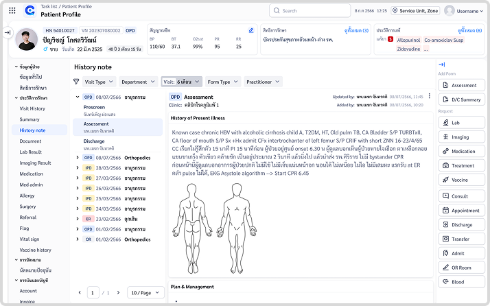
Before & after
Same task, same physician workflow.
Same task, same physician workflow — different number of clicks and seconds.
Outcome
Finding any menu in the new structure took seconds, not minutes.
The final usability test measured findability of the new navigation: each of five tasks asked a physician to open the menu and locate a specified item in the regrouped structure. With 7 participants, all five tasks were completed by everyone.
Time on Task — full results
Every task: open the menu, then find a specified item in the new structure.
Task 4 stands out with an 85s max and a 65s spread — the hardest item to locate, and the clear target for the next iteration. Worth naming directly: this is real usability data, not a highlight reel.
Deliverables: New layout system · Regrouped navigation (3 groups) · Validated prototype · Time-on-task report · Annotated dev handoff
Takeaways
What I'd carry into the next project.
Users don't think in your process; they think in their timeline.
The stage-based grouping looked right to the team. Physicians re-sorted it into past / present / pending within minutes. Card sorting cost almost nothing and prevented shipping the wrong IA.
Two weeks is enough — if every method is 10–15 minutes.
Paper sketches, 30-minute workshops, 15-minute card sorts. Small, cheap loops beat one big research phase when the clock is short.
Layout debt compounds quietly.
No single feature made the screen bad; years of additions did. A structural pass — banner, sidebar, dynamic content — recovered more usability than any individual feature could.